A new logo for a new year
If you’re reading our blog, you’ll have noticed (hopefully) a bit of a change in our logo and the design of the site. Last week we were thrilled to launch our new logo and branding with a small gathering of our supporters and contacts.
We, of course, love our old logo, which had served us well for many years. But it had begun to look a little dated and it was time to look at a refresh of the entire branding to make it fit for every purpose.

The old logo
A modern logo needs to work on paper, merchandise and digitally on devices of every size. It needs to look good as a thumbnail on a social media platform and on a large poster at an event. And it must do so representing the organization’s culture.
The main thing we wanted was a logo that was a lot cleaner and simpler. Whereas the primary version of our old logo had six separate colors (six!). Our new logo is a single tone, in one of our new brand colors.
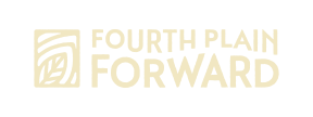
The leaf icon evokes nature and new growth, while the typeface shows a central “path” between the words Fourth Plain and Forward, representing both the Fourth Plain corridor and the nearby Columbia River.
It’s always a big decision for an organization to change familiar branding, but we are delighted with the results, and we hope you agree they look fantastic.